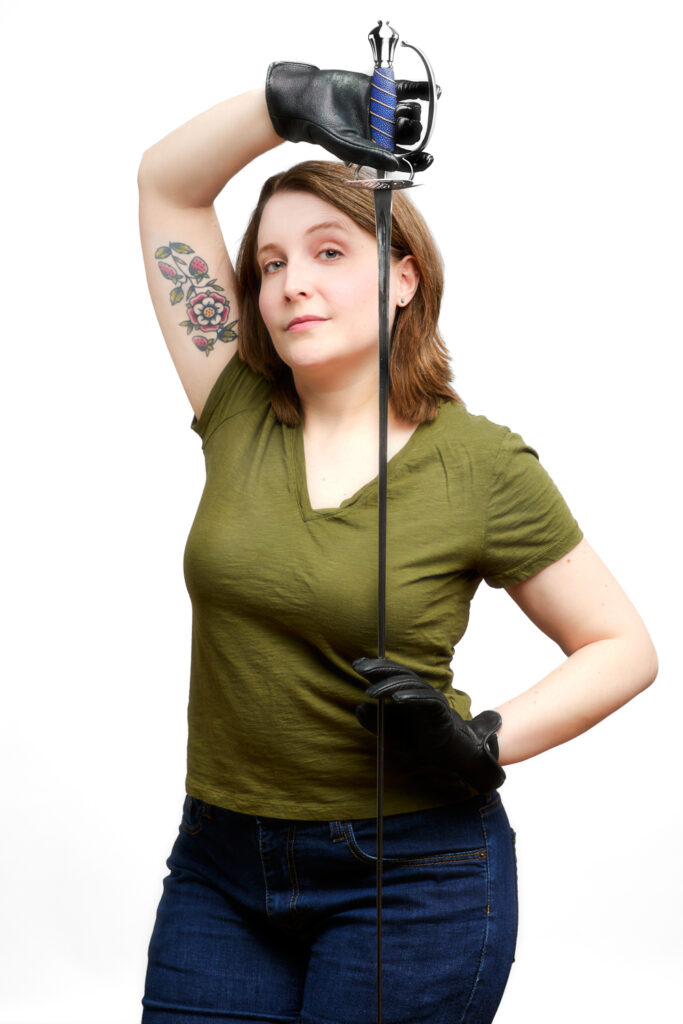
In late March, we made new headshots for Jennifer Mickelson—an actor, intimacy designer, playwright, SAFD Actor-Combatant, and more! Jen’s worked with theaters all over Chicago, including Promethean Theatre Ensemble, Citadel Theatre, Broken Nose Theatre, Idle Muse Theatre Company, and Babes With Blades Theatre Company (in which she is also an ensemble member). Jen and I have known one another for many years, as my very first theatre shoot was doing production photos for The Last Daughter of Oedipus, written by Jen and produced by Babes With Blades Theatre Company in 2010.
Jen was looking to get some updated headshots for 2024, so we talked a bit about what those headshots might look like.
The Assignment
Before the shoot date, I like to discuss the direction for the session. It helps enormously to understand what we’re going for. Jen helpfully provided these notes:
I sometimes joke that my schtick is rolling in wearing an over-the-top [costume] (frequently including a hat) and delivering exposition.
On the rare occasions when I get to do comedy, I’m the straight man, not the clown, so I don’t think a shot tailored towards comedic energy is necessarily a priority.
The characters I get hired for tend to be meduim-to-high social status, though not highest status (dukes, not kings). They’re usually smart/well-spoken; I do well with heightened or formal or stylized language. Often they’re hiding something or working behind the scenes. They don’t generally get pushed around, or if someone tries they push back, directly or indirectly.
So for a sort of general tone, maybe we aim to suggest power, cleverness, and a bit of intrigue, maybe with a hint of potential danger (what with the sword skills and all).
I would not mind testing out a slightly more romantic/softer type of vibe, but that would be low priority. Might be fun to perform a little intimacy some time instead of just choreographing it.
Jennifer L. Mickelson
For Jen’s headshots, we shot on gray and on white backgrounds. These were Jen’s three main selections.

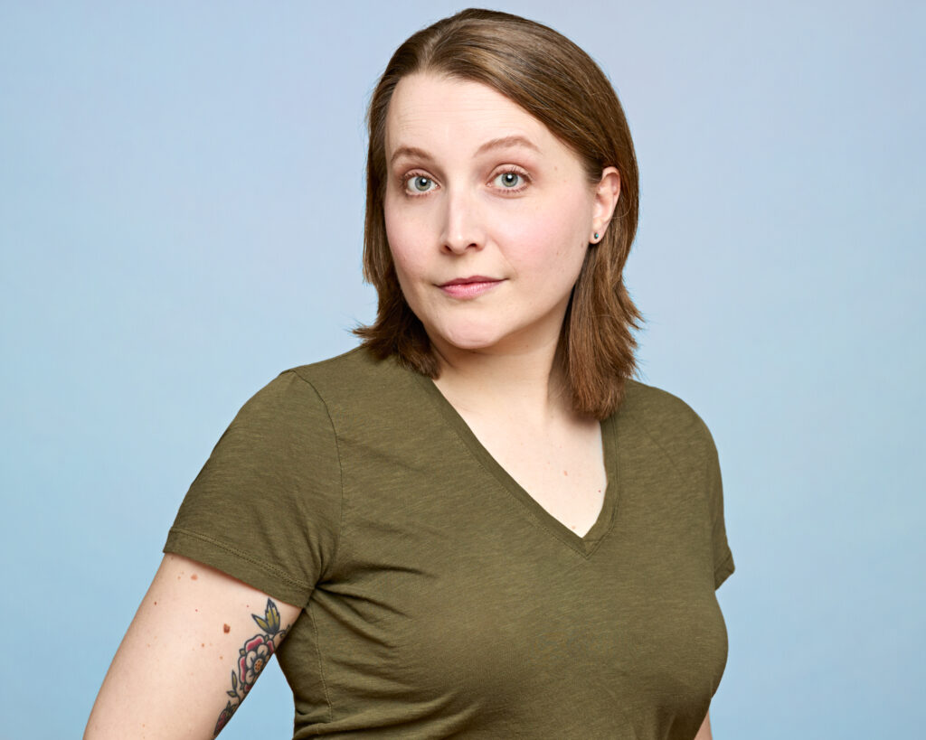

A Technical Diversion about Shooting on White
The white background is a popular headshot look because it’s clean, bright, high key, and minimalistic. There’s nothing to distract the eye from the subject. I don’t always shoot on white, but it’s one of my favorite options. We chose a white background for one of Jen’s shots to contrast with the black leather jacket she wore. For EDGE. CONTRAST.
I lit the background with two small white umbrellas at opposite ends of the background. I positioned them behind flats so their light wouldn’t bounce back on the subject. To ensure the background was uniform, I used the Measure tool on the iPhone. With this tool, I could place my lights at equal heights, equidistant from the background. Handy. Checking the histogram on the image, I noted that the background luminance was the same on either side of the subject (much like measuring the luminance values in Liz Radford’s painting last February), and voila! The background was uniformly lit, not overexposed, not overwhelming the subject.
The other benefit to lighting the background uniformly was that it was easy to select in Photoshop. Thus, in one of the selections we were able to easily change the background to a light blue with relative ease.
Shades of Gray
Gray is a versatile, neutral background color that you can shift toward black (by shooting far away from it so that little light touches it) or toward white by firing lights directly at it. In our session, we shot far enough from the gray background to tone it down just a bit. As a result, Jen’s photo shows a black jacket, gray background, and white highlights, with contrasting colors in the subject’s eyes and shirt stripes and her lips, which turn in a slight (yet potentially dangerous) Mona Lisa smile.

It was a pleasure making my friend Jen’s headshots this year. I wish her much success as she continues to kick butt from stage to page!




Follow Me