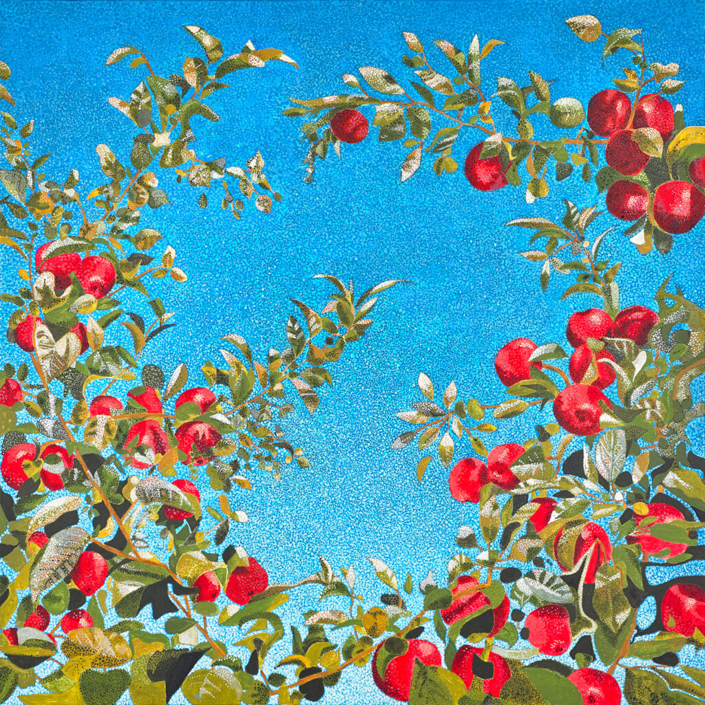
This week, I had the exceptional honor to work with my dear friend Liz Radford, who hired me to photograph her beautiful paintings.
We met in 2007 at Story Studio Chicago, where we were fiction writing students in Stephanie Soileau‘s class. With another student from our class, we formed a writing group that met regularly for around two years. The group wrote together, shared and critiqued work, exchanged ideas, and learned from one another. It was an important time for me as I transitioned from performance to written narrative. I always admired Liz’s work and literary style. Liz’s writing casts a spell. It definitely influenced me, and her characters’ way of speaking and thinking occasionally ended up in my characters’ mouths and minds, since we shared so much work over the years.
After the group, I joined Liz’s book club, which exposed me to new books and new friends. Then Liz went off to get her masters degree in fiction at Northwestern University while I pursued role-playing game writing. Over the years we’ve continued to catch up.
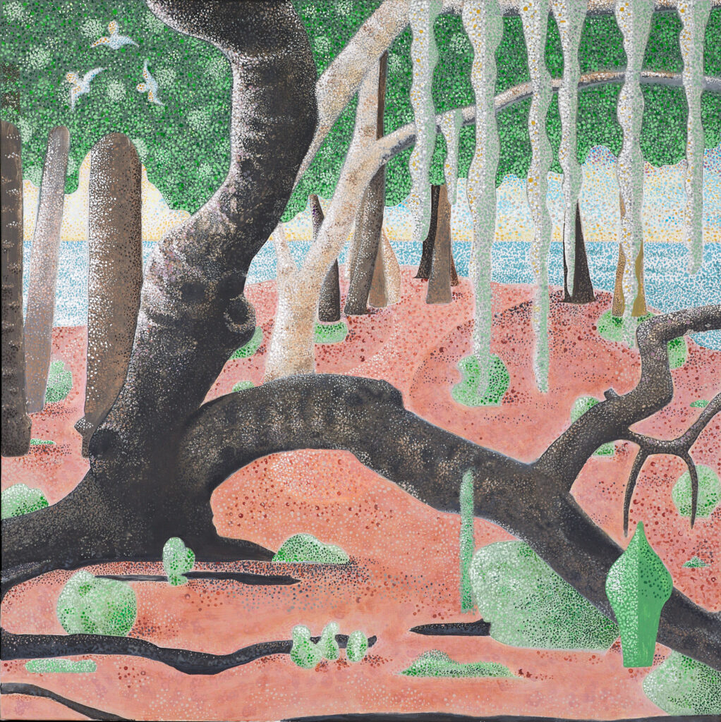
During a pandemic-era phone conversation, Liz told me she’d taken up painting. She described the art that she did in a pointilism style, where many, many, many small dots create an entire picture. Liz described the peace and happiness she experienced creating her paintings. I related to this, as I felt similar peace staying up late painting miniatures during the pandemic.
At Liz’s holiday party this year, she talked to me about having her paintings photographed. I’ve photographed art before, and I occasionally teach related workshops on photographing toys and products. So, in February 2024 we made it happen.
Photographing Art
There are lots of articles about photographing art online, and a great many of them suggest using natural light, which is a little misleading. What these articles are trying to communicate, however, is that it’s best if the painting is evenly lit, which you can often get from window light or the diffuse light of a cloudy day.
We had window light like that for two shots. Then clouds passed over the sun. We compensated for this by using a tripod and a long exposure to take our shots, and that may have been fine, but I didn’t want to risk it. So we switched to light we could control to get the same effect consistently with every shot.
I brought two big, white V-Flats, two lights, and two small umbrellas. Then I fired the light into the umbrellas, which expanded it; that expanded light bounced against the white foam core of the V-Flats set up at a 45 degree angle to the painting, and then the light spread even further across those broad, flat surfaces, which acted like tall windows, resulting in very soft light—like natural light, except we could control it.
I used a color checker card in my shots so that I could create a camera profile based on my shooting conditions for perfect color.
Editing
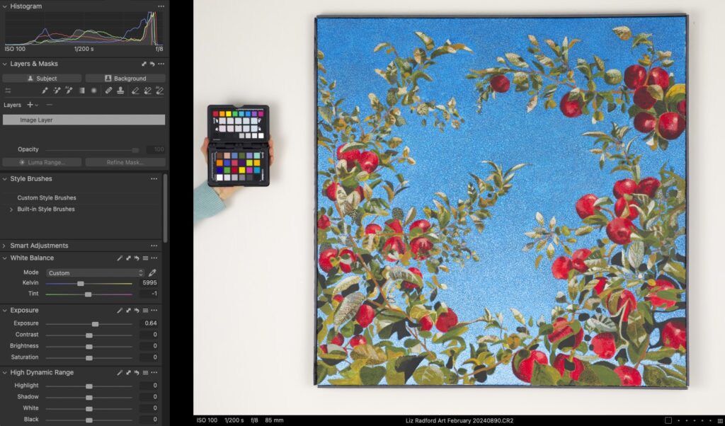
When I had finished shooting and moved on to processing the photographs, I corrected the color via the color card and then began to edit for appealing contrast on my calibrated monitor. I made my adjustments trying to be mindful of my histogram so no information was clipped or fell off the edge of the histogram. Those were my personal parameters for how far I thought I could edit.
In the screen shot above, there’s an indicator on the histogram in the top left corner of the screen shot, which shows the luminance of that particular area of the photograph. As I moved my mouse around the wall areas that surrounded the painting, the luminance indicator remained in the same place on all sides of the painting, with minimal variation until I moved the mouse into the soft shadows directly to the sides of the painting, in which the indicator dropped down. This is how I could test to make sure that my lighting had been even across the surface of the paintings.
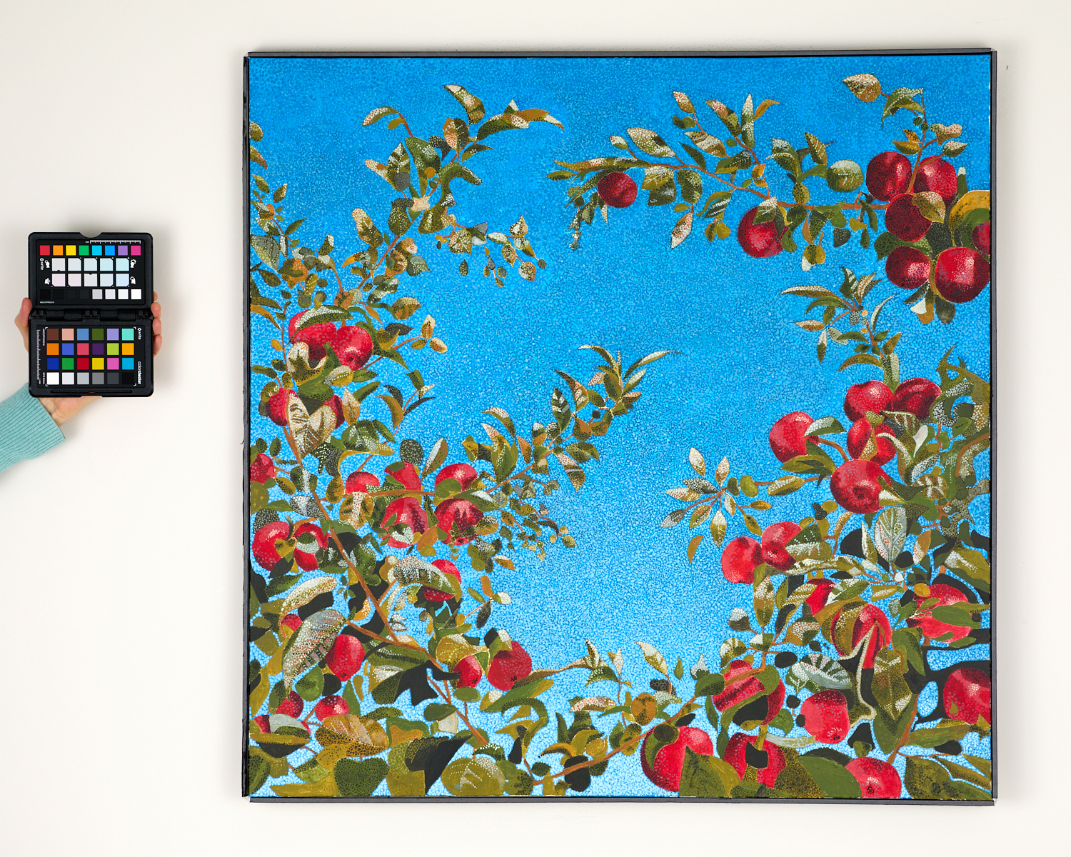
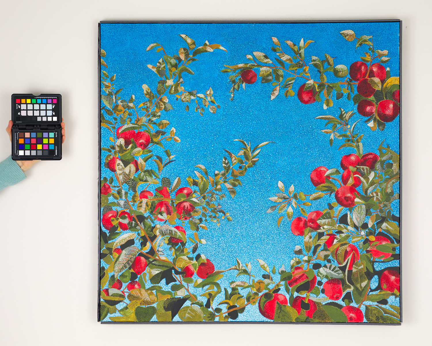
ABOVE: Before/after color correction. Notice how significantly the reds change.
I continued to edit the paintings until they looked good onscreen, making tweaks to Liz’s taste. Once Liz was satisfied, I uploaded her files for her to convert into prints and share online. We’ll continue to work together as she decides what size her prints will be and what color profiles she’ll use.
Many Thanks
Special thanks to Josh Tulisiak, one of my colleagues from my time at the Institute for the Study of Ancient Cultures (previously known as the OI) at the University of Chicago, and to photographer Charissa Johnson. Josh works in museum exhibits and graphic design where proper color is vital. Josh, Charissa, and I all worked at worked on projects at ISAC together. After photographing the paintings in a controlled and calibrated environment, I touched base with Josh and Charissa regarding any best practices in faithfully editing artwork for print. We were all on the same page, yet I felt better for having checked.
It was once again an honor doing this work for my old friend and literary companion, Liz Radford. She remarked once that painting is easier than fiction, and I laughed because I found that to be true for myself as well. I love the beautiful work Liz is doing, and I can’t wait to see her next project!







Follow Me