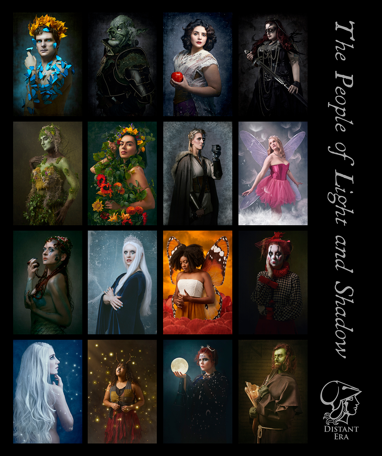
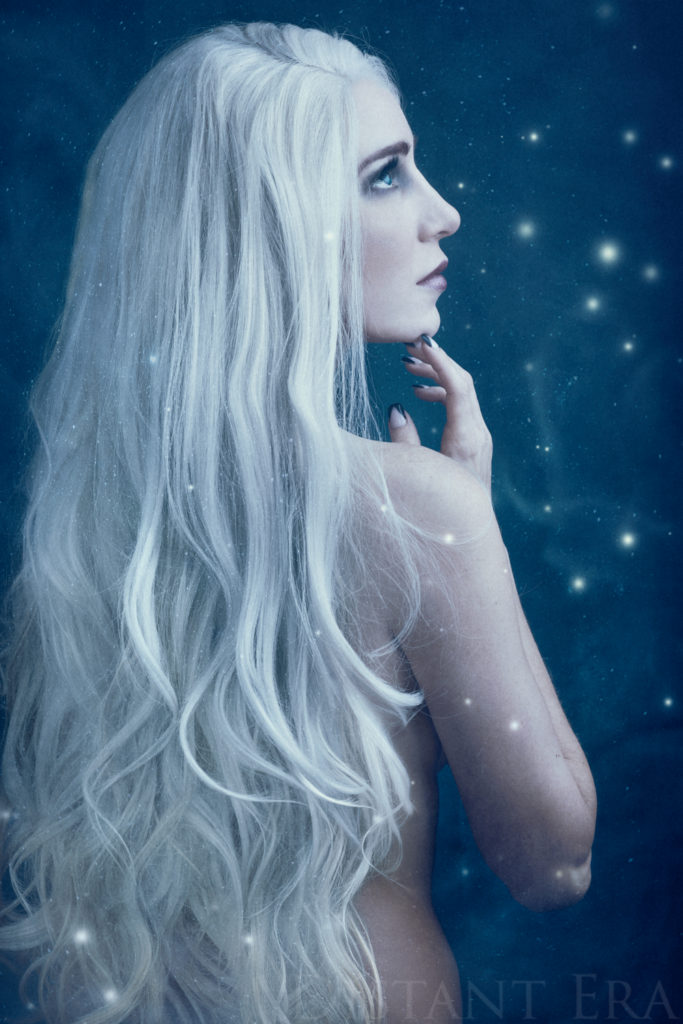
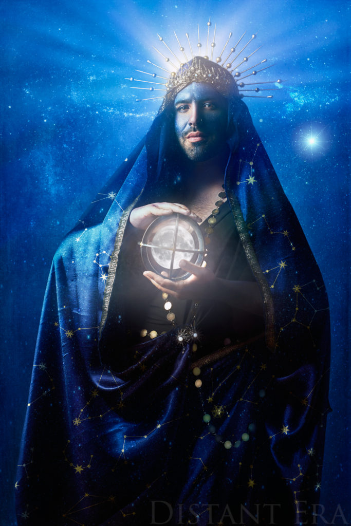
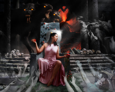
As we move into the final quarter of The People of Light and Shadow series exploring the characters and creatures of fairytale and folklore, I have ordered prints for all the series images thus far.
Prints???
Aye, in sooth. Prints. Matted fine art prints. Wall art of the kind we used to have in the pre-digital days. Many of us have fallen out of the habit of printing images because with our smartphones we can capture and carry thousands of images that we can have on hand at all times. In some ways, our home screen and desktop background has replaced our wall art.
That’s all fine and good, but it isn’t quite the same as framing a printed image and hanging it on your wall where you see it every day. This is really impossible to explain until you’re looking at a high quality print—especially an image that is specifically created and edited to be printed.
The Wow Factor
For every series after our first experimental endeavor (Urban Fantasy), the subjects of the series have received a print of their final image from the series. At the level of editing and retouching in The People of Light and Shadow, these printed portraits (and their digital files) are commissioned for several hundred dollars apiece, so the subjects in these series are receiving an art object of value in exchange for their time, talent, and a signed release.
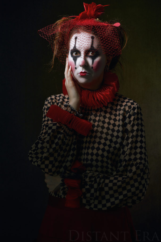
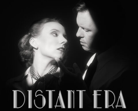
For our second series, Portraits from a Distant Era, we ordered canvas prints, and the difference between seeing the image on a phone or monitor versus seeing and touching the physical object on display was striking. I don’t think I told the subjects about the prints on that one—I invited them over for a wrap party where I displayed all the canvases on easels around the room (with some on the wall when I ran out of easels). We had wine and cheese, and the subjects got to walk around the room and see the whole series arrayed in front of them. It was amazing to see them all together, and I still enjoy seeing them when I visit the homes of those subjects, where I see them hanging on the wall.
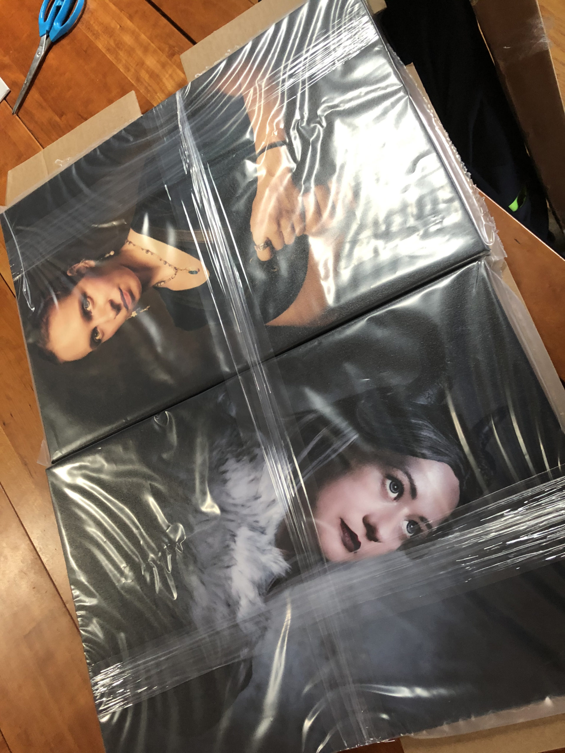
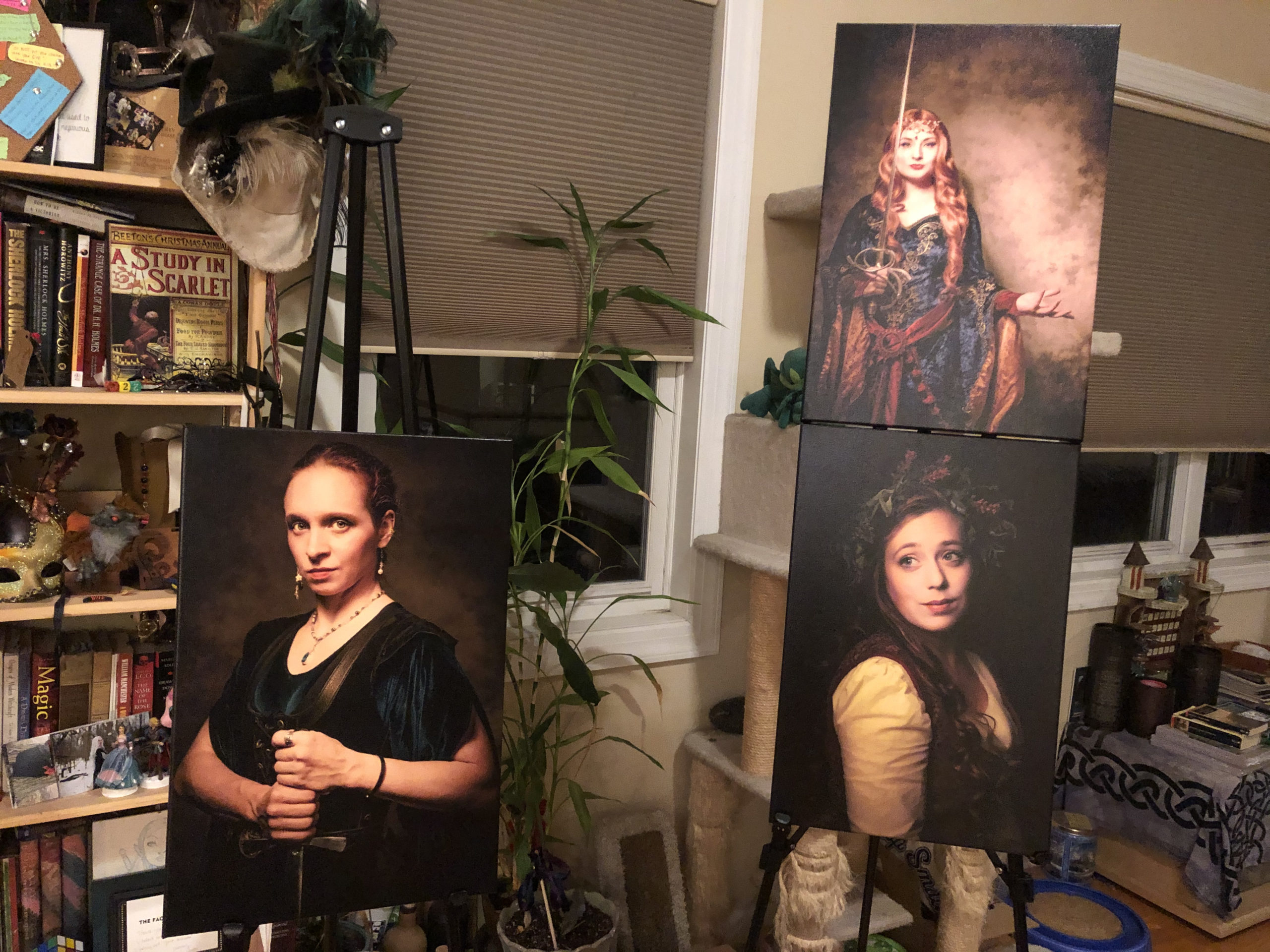
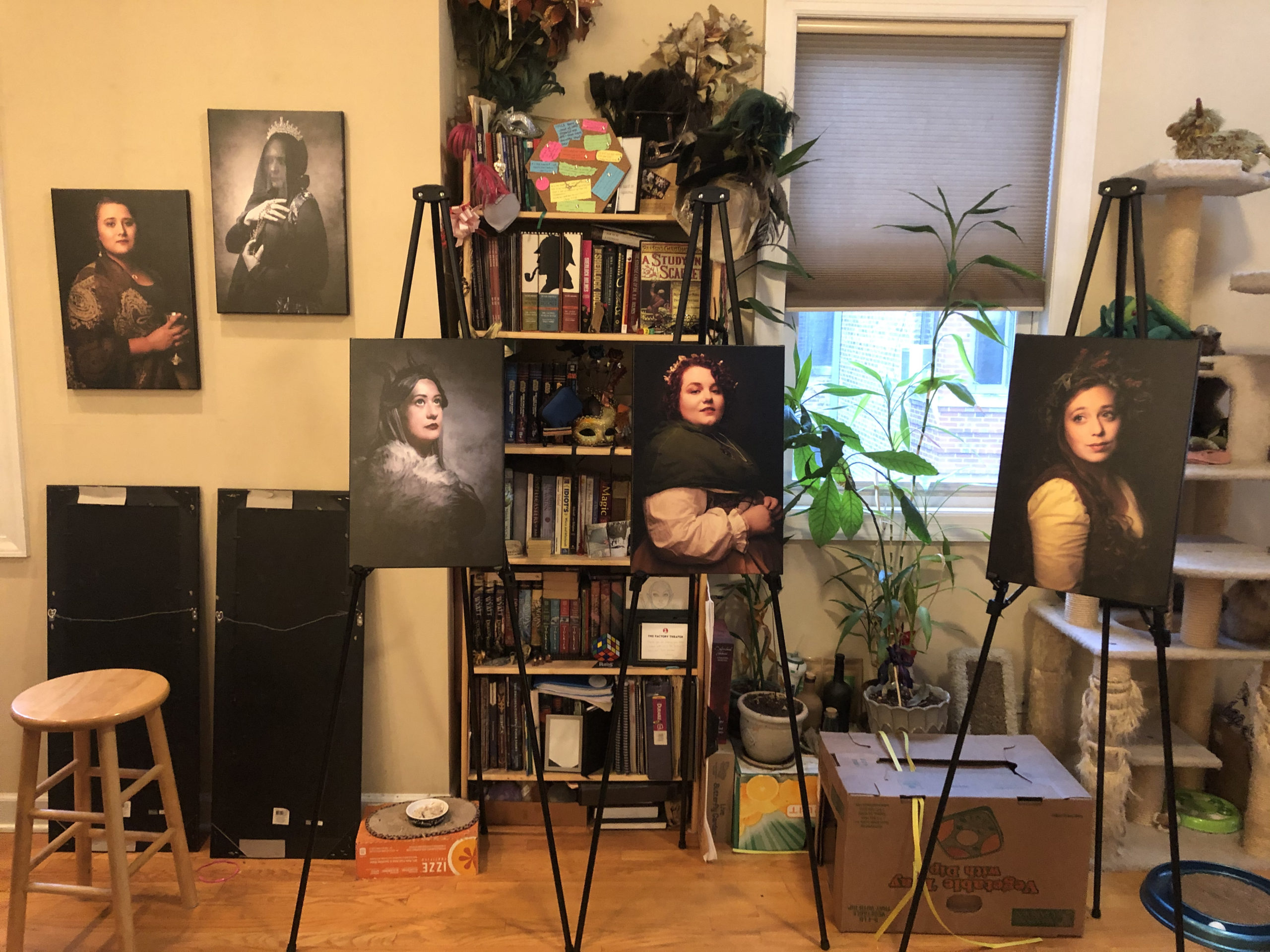
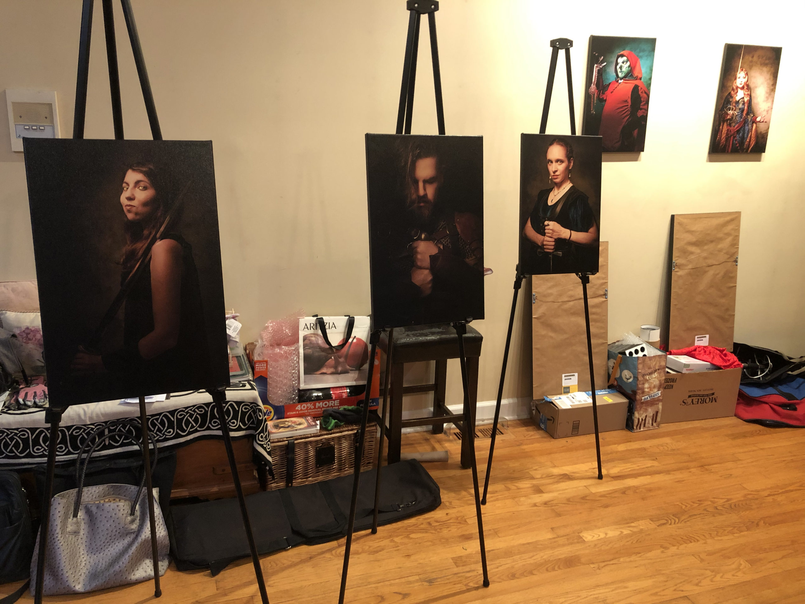
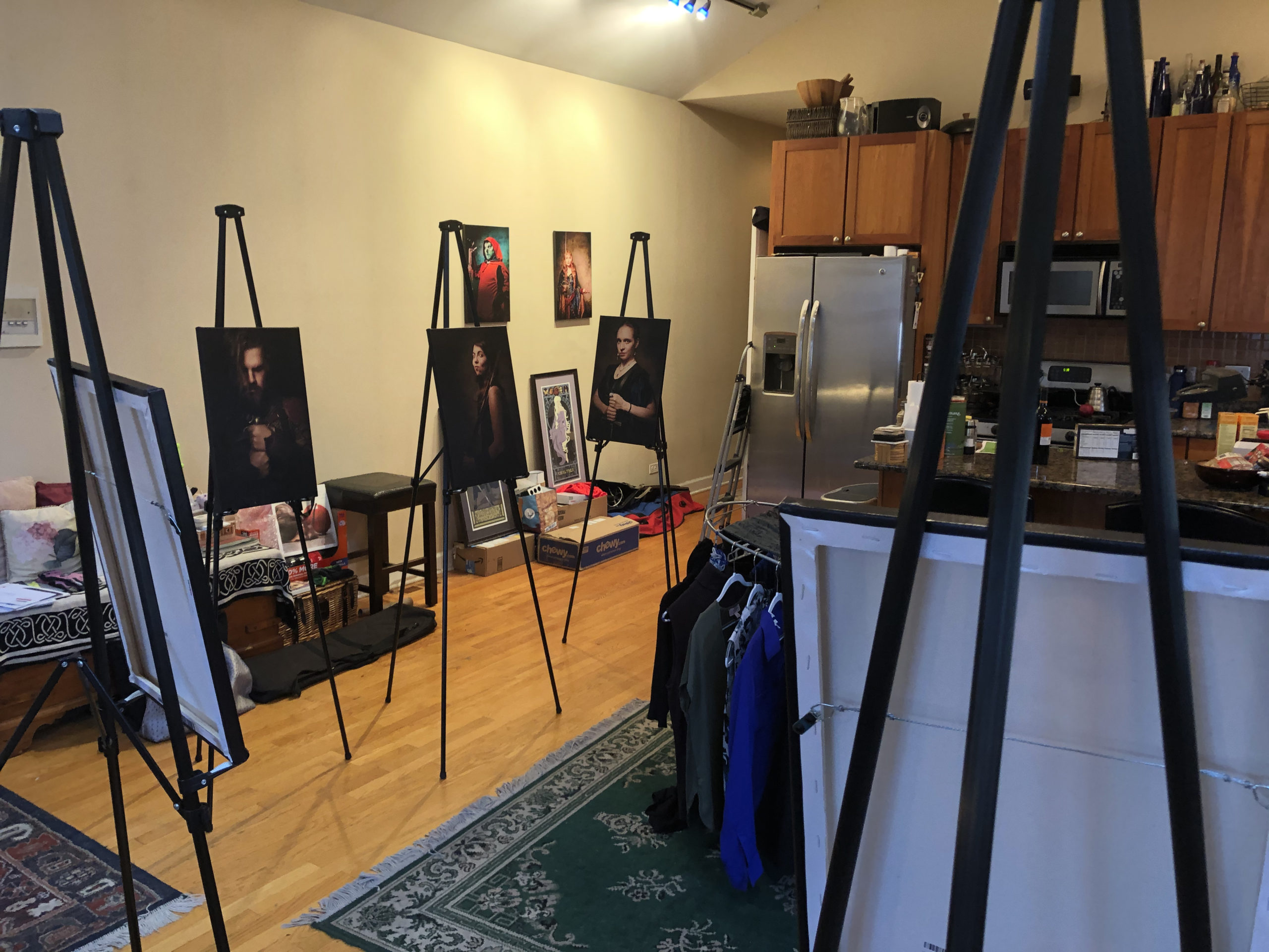
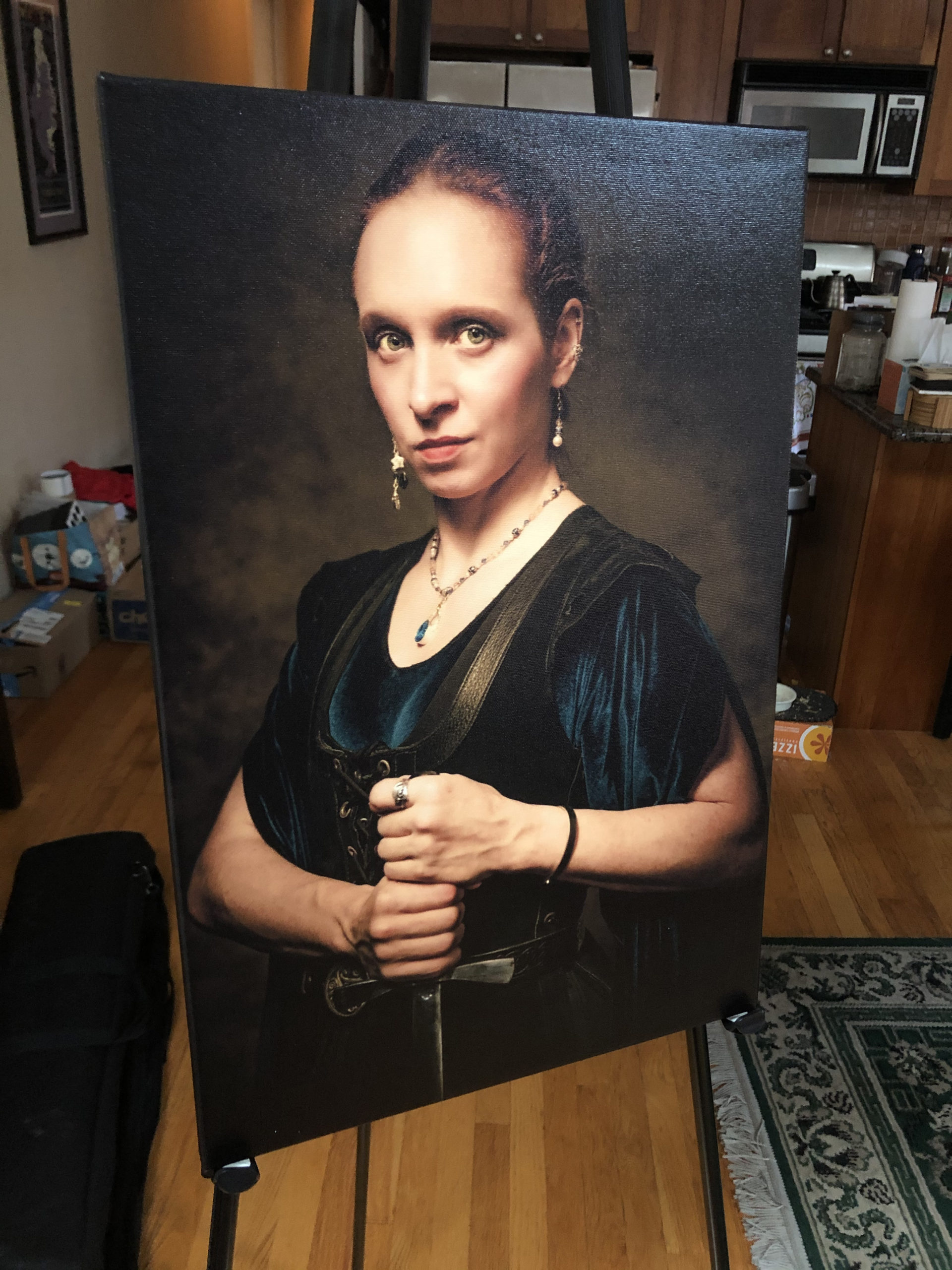

The disadvantage to canvas prints is that they’re unprotected by glass, so if you happen to scuff or brush them, or if they fall down, the images can be marred. In our super ambitious and effects-heavy second series, Hauntings from a Distant Era, I opted to go for framed prints from a professional printer, which I distributed to the subjects. These looked very nice as well, though I noticed that some of the darker images could be a bit murky, and these being “hauntings” images, there was a lot of darkness and shadow. I was perplexed as to how to remedy this at the time, but I’d learn eventually.
In our Blade-Runner-inspired fourth series, A Distant Era: Chicago, November 2019, I went for metallic prints that would evoke a cyberpunk feel. These looked really cool in a way you can’t replicate on a monitor screen, and since the series used lots of colored gels, those metallic prints had a beautiful and unique character.
The Contract was an after-the-fact series done as a sort of maternity session for a friend and a proof of concept for a commissioned portrait series called Protagonist that Distant Era offers to those who wish to document their personal story. I had these printed from the same printer who did the last two series, and to my recollection they looked positively grand as a narrative sequence.
Over the course of these first series, I refined my printing process and education on how and where to print. And yet, as beautiful as these prints looked, I couldn’t help but imagine they could be even better, especially in the darker areas. The solution to this—editing for print—was one of my projects during the long quarantine.
Editing for Print
What does that even mean? For me, it meant that having a better idea what my colors were doing, especially the highlights and shadows in an image, and editing an image so that what I see on my monitor is as close to what the final print looks like. The first step in this was learning to calibrate my monitor.
Monitor Calibration
To calibrate your monitor, you need a colorimeter that can take a reading from your monitor and adjust the hues and tones so that they’re all in alignment. That’s my very unscientific explanation. However, the first time I calibrated my monitor, I noticed a huge difference—then incremental changes as I continued to keep the calibration up to date.
Accurate Color
During the pandemic, my computer failed and I had to replace it. The new one no longer connected to my old monitor, and rather than buy numerous dongles to try and make it happen, I went in search of a new monitor. In my research, I learned a lot more about color spaces and specifically about the Adobe RGB color space, which was designed to parallel the CMYK color space used for print—though most monitors can’t show the full range of Adobe RGB’s color spectrum, but some can. I went in for one of those, which has a matt display (as opposed to my previous glass display), and as a result I’m able to carefully fine tune what will show up on a print, with an accurate idea of how it will look.
Quality Printing
But it isn’t just a matter of calibrating your monitor correctly and regularly or displaying colors accurately. The printers I had been using previously only accepted standard RGB images—which means that after all that work honing the portraits for accurate color for print, that information was going out the window in the file I’d have to send to the printer. So I looked for a new printer.
I found a company in Italy that creates absolutely gorgeous matted prints on HD fine art stock, which has an incredible texture and an estimated lifespan of three hundred years. I’m amused that they’re made in Italy and like to imagine they’re following a tradition of portraiture that goes back to the Renaissance. While there will always be a difference between an image you see that is backlit by a screen versus an image that is printed on paper and lit from the outside, the first prints I received were dead on when I held them next to a window and looked just like what I had edited on my monitor. One of the subjects for The People of Light and Shadow said she really didn’t need a print because she wouldn’t know what to do with it. Then I showed her one of those prints. “Oh,” she said. “I see.”
I look forward to receiving the latest round of studio samples for The People of Light and Shadow. Even more, I look forward to rewarding the subjects with lifelong keepsakes of their work.
To those fellow time travelers and world walkers who would like to commission Distant Era to make your fantastical portrait, please do get in touch!







Follow Me