“It is written, they appear to men like angels of light: light is an effect of fire, and fire will burn…”
-Dromio of Syracuse, A Comedy of Errors
The Devil: Lorelei Atreides

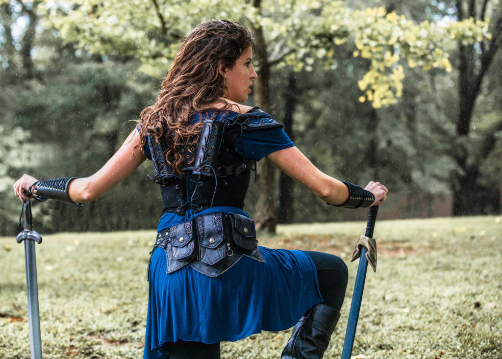
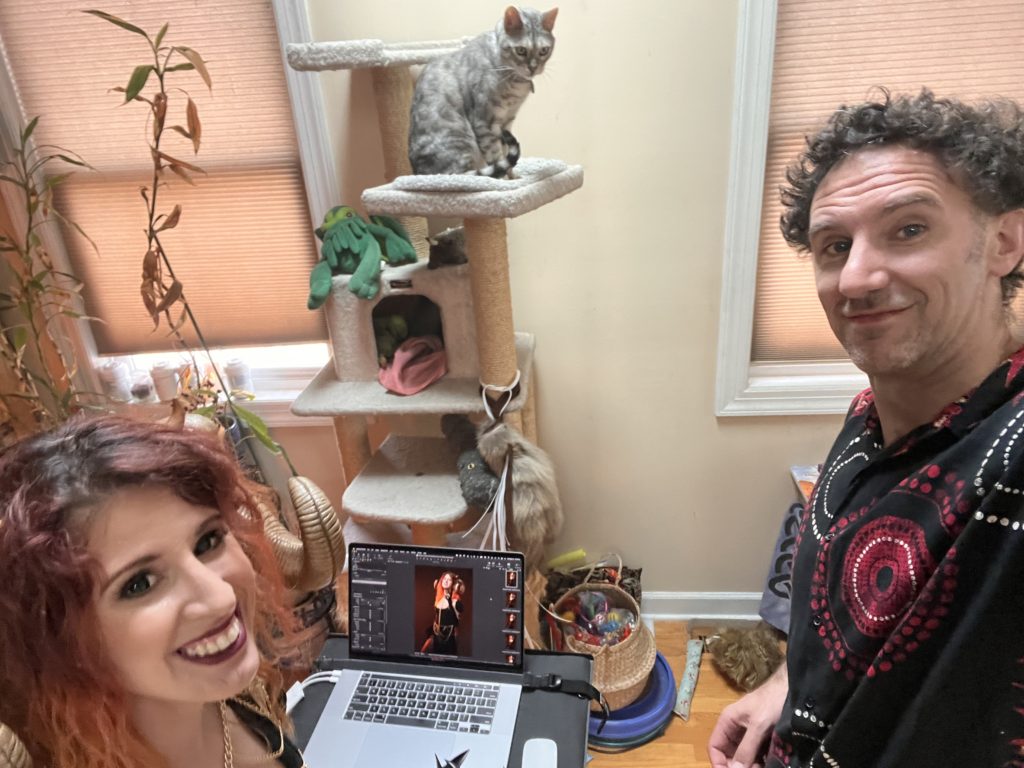
Lore joined The People of Light and Shadow series the traditional way: wine and board games (the same way “The Orc Scribe,” “The Wood Wife,” “The Harlequin,” and “The Tataille” joined this series). In the summer of 2021 as the idea for the series was coming together, we gathered for an evening of fun and games, and as we caught up in the kitchen I mentioned the series and asked if Lore would be interested. Lore and I had first met in early 2018 in the world of live action role-playing games. I had shot several event photos of Lore as a badass warrior, but she’d never been the subject of one of my formal sessions. I’d always wanted to properly photograph Lore, so I was thrilled that she was interested in joining the series.
Lore pitched the idea of the devil as her figure for The People of Light and Shadow, and I was excited to delve into the mythology of the diabolic—we hadn’t explored these prominent figures of folklore in the series, and I was especially interested in the potential hues we might get to use. As the series unfolded, it favored cooler colors; I wondered if we might do something with warmer, redder hues for the devil.
Speak of the Devil: Lorelei Atreides on Playing the Devil
Eve takes the apple of knowledge.
Lilith gets banished for refusing to obey.
So many cultures have similar stories, and the sentiment “I would rather burn than bow” has really resonated with me lately, especially with all the recent events surrounding bodily autonomy.
If others are going to paint me as aggressive, or evil, or intimidating, then I don’t want to crumple under those labels.
I would rather be empowered by them.
Photography
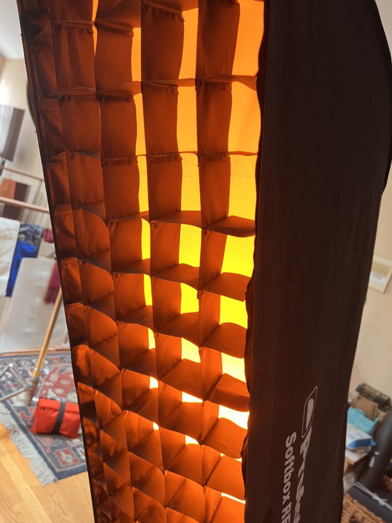
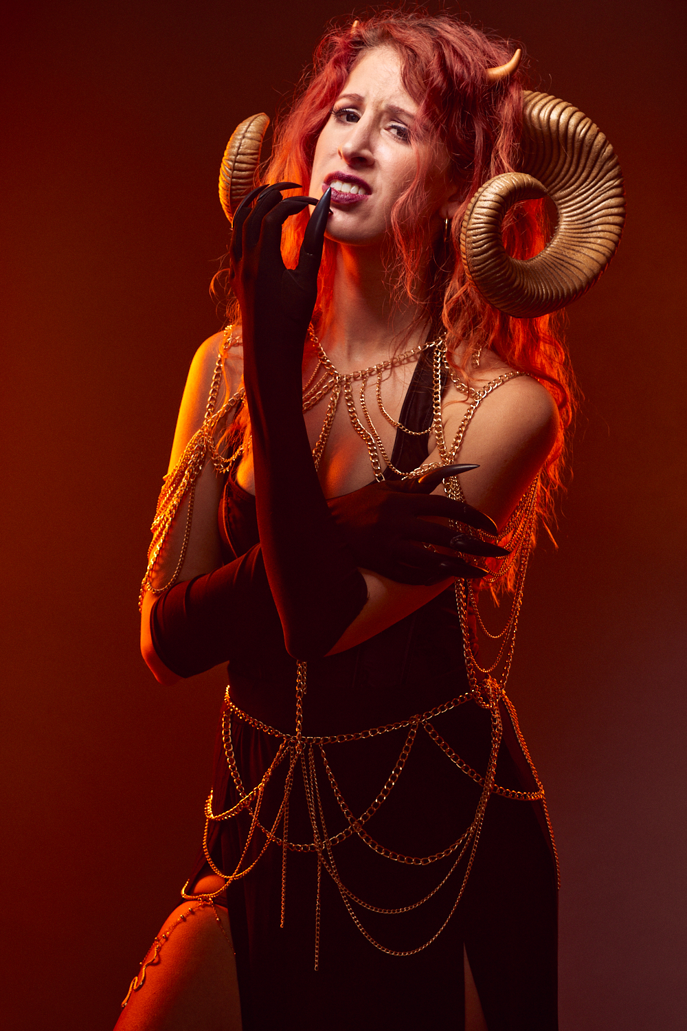
As we’ve progressed through the series, I’ve gradually introduced new elements. I think about each of them carefully because I want the series to remain consistent even as it explores new territory. More on consistency later. In this portrait, I was sure I’d want flames. If I introduced flames, their hue would color Lore’s skin and be reflected in the highlights. To make this happen, I placed a strip box to either side of Lore, and I gelled these lights orange. I also gridded the strip boxes so that the light would be relatively contained and specific. For my main light, I used a beauty dish positioned to Lore’s left and angled down. The beauty dish is a semi-hard-light reflector that can produce nice specular highlights and emphasize facial structure in the way it casts shadows. I hadn’t used gels in the series thus far, but this seemed the perfect excuse to introduce them.
Rose Nobs, makeup consultant for The People of Light and Shadow series, did an amazing job applying Lore’s makeup. She created a classic beauty look for the devil that fit the concept of a tempter.

We shot on a gray paper background that took on a red-brown cast from the gelled lights, and we kept the same setup for the session. Keeping the same setup throughout the session is unusual for this series, where I often experiment with different backgrounds and key lights, but in this case we knew what we wanted, and we felt like we were getting it from the initial setup. We were very pleased with the way the orange lights cast strips of warm light on the skin. When we saw it working, we never considered removing them.
The challenge in this setup lay in positioning Lore just in front of the orange lights and directly in the line of the beauty dish. Take one step back and the gels would color everything orange, and that very specific beauty dish would miss Lore’s face. If the gelled lights touched the face, yellow highlights would appear. I wanted the white light of the beauty dish to emphasize Lore’s face, keeping it neutral, while the rest of her figure could be immersed in this fiery glow, and we were able to achieve this on most of the images we shot.
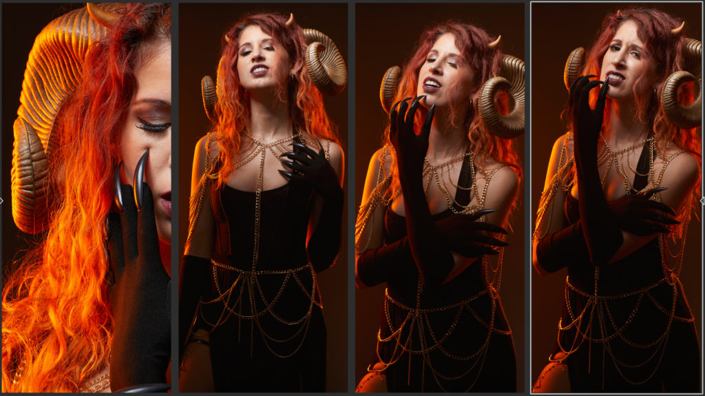
I love the pose that Lore did for “The Devil.” Eyes half closed, claws caressing her face, arms perpendicular in the shape of an inverted cross, I could imagine her basking in the flames of Hell. Alas, the freaky dark contacts Lore wore aren’t visible in this portrait, but it was my favorite expression from our session.
This portrait was shot with the standard settings for The People of Light and Shadow: 85 mm focal length, aperture at f/8, ISO 100, shutter speed 1/200.
Editing and Compositing: The Devil Is in the Details
I knew this one was going to be a challenge. In addition to the regular retouching process, there were flames to be added. Those didn’t seem like too much trouble. (They would be.) But what about the nails? The nails were on the ends of the gloves. Would the gloves need to appear that they were ripped at the fingers so it looked like they were tearing through? With the gloves being black, how would this be achieved? The ram horns were plastic, with pronounced plastic seams, glitter, and extra flash (extra pieces of plastic that weren’t cut off in the manufacturing process). What would need be done to improve their look? Should the devil have wings, and if so, what kind of wings, where would I get them, and how should they be composited and lit (not having been lit by gels)?
We shot this session in late May. I made a quick mockup with the devil surrounded by flames, and for a while I was tempted to believe this would be easier than I thought. In the early weeks of June, as I worked to finalize the details of “The Muse, Urania,” texturing constellation patterns into the robe and stars and adding rays of light into the overall composition, summer obligations began to stack up. After Urania was finished, one by one I tackled the details of “The Devil” as June rolled into July and July’s full calendar kept me juggling tasks.
Claws
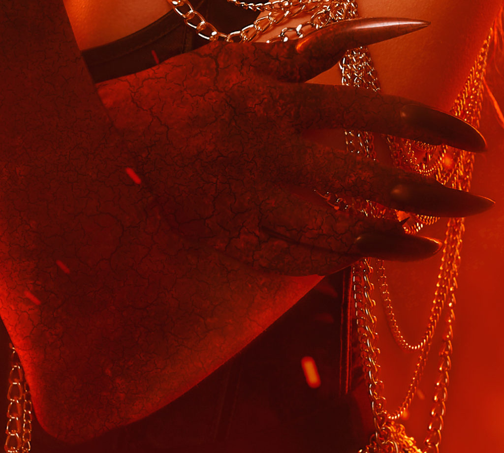
It made the most sense to me to turn the gloves into claws, and it seemed those claws should have fire-cracked and blackened skin. I applied a texture and masked it. The texture on the gloves still showed through, so I blurred the cloth texture on the gloves underneath and then went back and placed the cracked texture on top, dodged, burned, masked, and so on. I went a bit further refining them after this, but here’s what the claws looked like as I was working on them.
Horns
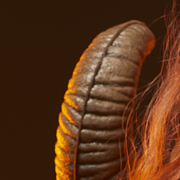
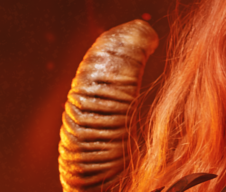
After the claws, I went on to remove the excess plastic from the horns, including the seams and flash. I added some texture to the horns to give them some additional tone. For a long time this texture was too dark and contrasty. I pulled it very far back in the end. As I’m writing about these aspects, I’m fixing little problems, dodging and burning places that are too dark or too light.
Wings
Next I started to think about wings or a tail. I added wings a few times, but the way the portrait is framed, it was difficult to squeeze wings into it without cutting them off. I could have made the portrait larger, but Lore would have appeared smaller in the frame, which would have made this portrait inconsistent with the others in the series. Adding to that, the wings weren’t lit the same way as the subject. Plus, I didn’t photograph wings myself, which meant I’d have to use a stock asset and attempt to angle them in various ways… which I did… but I couldn’t get them to look just right. As I began to add flames, the wings got lost or looked strange, so I scrapped them. There wasn’t enough room for them anyway.
Flames, Tone, Texture, Consistency
This was the most challenging part.
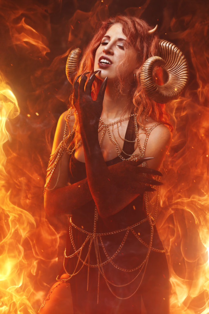
I began by going hog wild, covering everything in flame. This seemed cool at first but didn’t look right. Eventually I found that I preferred to use a simple texture rather than FLAMES EVERYWHERE. Then I reconsidered the wings, went back and tried to add wings again. The results were better, but it still felt like excess. There was too much going on. I scrapped all of that and started the flames over again.
One of the problems I kept running into with the flames was that whenever a background element was brighter than a foreground element, things looked bad. The mask around my subject looked bad. Bits of mask around the hair appeared and looked bad. The solution? Don’t do that anymore. I also feathered the mask a little, which gave a more pleasing unity to the portrait. You might say that this is common sense and I should obey the laws of physics, and you might be right. So yes, I started over again with the flames.
This time, I used two sources of flame, matching the two soft boxes that I’d used at the shoot. You might think I should have done this from the beginning, and you might be right. I couldn’t resist the urge to add some subtler flame elements, so I began building those up again in the background until they were too much, and then I pulled them back.
Many times, there are troubles in a photo that aren’t evident at first. In the initial (unedited) photo, Lore’s face is illuminated, and her body is in shadow in the places where the orange lights aren’t tracing it. It looks great in its original lighting, however as I began to add other elements to the portrait, the portrait brightened. As the portrait brightened, Lore’s face brightened. There was a point where that brightness became a distraction, and when I realized this, I went back and toned down her face to make it consistent with the rest of the image.
Ixion, Sisyphus, or Tantalus?
I’m still making my way through Stephen Fry’s mythology series. I’ve finished Cosmos and Heroes and I’m on Troy. You may ask, Which prisoner of Hades do I most resemble in this endeavor? Am I Ixion, appropriately bound to a wheel of fire? Am I Tantalus, forever reaching for food and drink that is ever out of reach? Am I Sisyphus, pushing that boulder up the slope over and over again, nearly reaching the top, always starting over?
The People of Light and Shadow has followed a certain style as we’ve produced it. Subjects are front and center, usually a three quarters portrait. Backgrounds tend to have some texture but aren’t scenic composites—there aren’t any castles or dragons or locations. They are colorful and don’t tend toward high contrast. They are photographs first and foremost; though they almost always feature composited elements, I’ve resisted using any paint filters on them, preferring instead to adjust the tones in the photograph in order to balance the photograph’s elements. They don’t tend to be “busy.” The challenge with these portraits sometimes is not just to create a portrait but to create a portrait for The People of Light and Shadow series, following the style that has been established by that series for the previous eighteen portraits/one year. If this series were a record, the music would need an internal consistency despite each song being its own unique element with its own particular rhythm and melody. Though each individual portrait presents its own variation on the theme, each must also be consistent with the theme, and sometimes identifying what is, and what isn’t, a portrait in The People of Light and Shadow series isn’t always evident. In the case of “The Devil,” flames are brighter elements than I’ve typically used in the series thus far, and since I want to show the devil basking in a fiery Hell, I have to decide what that looks like within the context of the series. This took some time.


Speaking of the Devil: Story Inspirations
It’s fascinating, the way humans have characterized evil and chaos over the past five thousand years. They’re often portrayed as serpents or dragons: Tiamat the primordial sea goddess of ancient Mesopotamia; Egypt’s Apep, the great serpent that Ra battles, thwarting Apep’s attempts to swallow the sun; the Midgard Serpent (and by extension Loki) of Norse mythology; the serpent that (was retconned to become) the devil in the Garden of Eden. (Note the golden serpent on Lore’s leg in the portrait above.) In Western tradition, the devil has been characterized so broadly over the years (Beelzebub, Lucifer, Satan, Baphomet, and so on) that it’s difficult to know exactly who we’re talking about when we’re talking about the devil. And yet in popular culture we know the devil when we see it—the devil’s symbols are instantly recognizable—horns, cloven hoofs, perhaps wings or tail, a pitchfork. Every part of Lore’s costume for “The Devil” symbolized an aspect of how we perceive the devil in the mythology—the chains encircling her like bonds, the serpent charm crawling her extended leg, the nails and horns and black eyes.
The words “demon” and “devil” are sometimes used interchangeably. I appreciate the way they were eventually classified in Dungeons & Dragons 4th edition lore: demons are beings of mindless chaos and destruction that were corrupted from a rift (the Abyss) that touches an alternate dimension of horrors; devils are rebel angels imprisoned in the Nine Hells until they gain enough souls to break out. Devils want to rule the universe; demons want to destroy it. As a delineation, it’s simple and it works.
Favorite fictional demon or devil: probably Crowley from Neil Gaiman and Terry Pratchett’s Good Omens.
Favorite mythological demon or devil: It’s either Krampus or Medjed.
Immense thanks to Lorelei Atreides for bringing the devil into this series. It was a big challenge, and well worth it. Great gratitude also to Rose Nobs for creating such beautiful makeup for our devil.
Next in The People of Light and Shadow series…
The final portrait in this series is one cool customer…


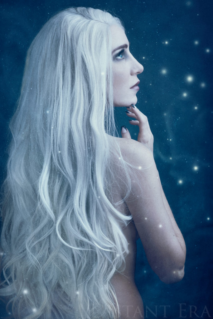

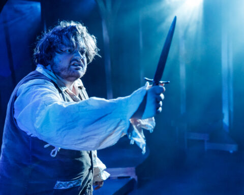
[…] had worked so well with “The Devil,” casting a fiery glow on our last subject that I wanted to try blue gels in this frosty […]