It’s been a week of accomplishing tasks that had fallen by the wayside. Technology updates, maintenance, backups, as well as some time spent on the most simultaneously important and unimportant task of 2025 and 2026—the rebuilding of the Distant Era website which, though it remains online, has been frozen in time for two years.
Since that’s where my focus was last week, I’ll take a brief diversion from the photo process to talk about this design process that has been occupying my thoughts.
Redesigning the website is unimportant because virtually all my work comes from referrals, I exist on social media, and the blog portion of my site (the one you’re reading right now, which is not changing) holds hundreds of posts and examples of what Distant Era does, shown in detail.
However, reconstructing the website is important because it is the first place anyone who doesn’t know me thinks to go to contact me. It’s the first impression, the hub, the domain the search engines recognize, the official headquarters on the web.
Time for a Change
Due to a number of factors too complicated to explain in a small post, I have been unable to edit the site for two years. Further, I built the site during the pandemic when it didn’t need to do anything more than announce Distant Era’s existence and show some work.
Six years after launching the site in January 2021, our work has expanded and clarified, necessitating a revision of the site that more accurately represents what Distant Era is and does.
Revision
In the first version of the Distant Era website, I wanted to create an experience and a mood. Back then, I was writing and editing professionally. Language was the tool I felt the comfortable using, and the original Distant Era site indicates that with its alliterative menu items and its poetic descriptions.
Cut, Cull, Combine
Six years later, my impulse has been to cut and to cull. I typically begin with descriptive paragraphs that I refine into more specific language, cutting extra words. Inevitably, whenever I remove text, the site feels stronger, better, more useful, and more efficient.
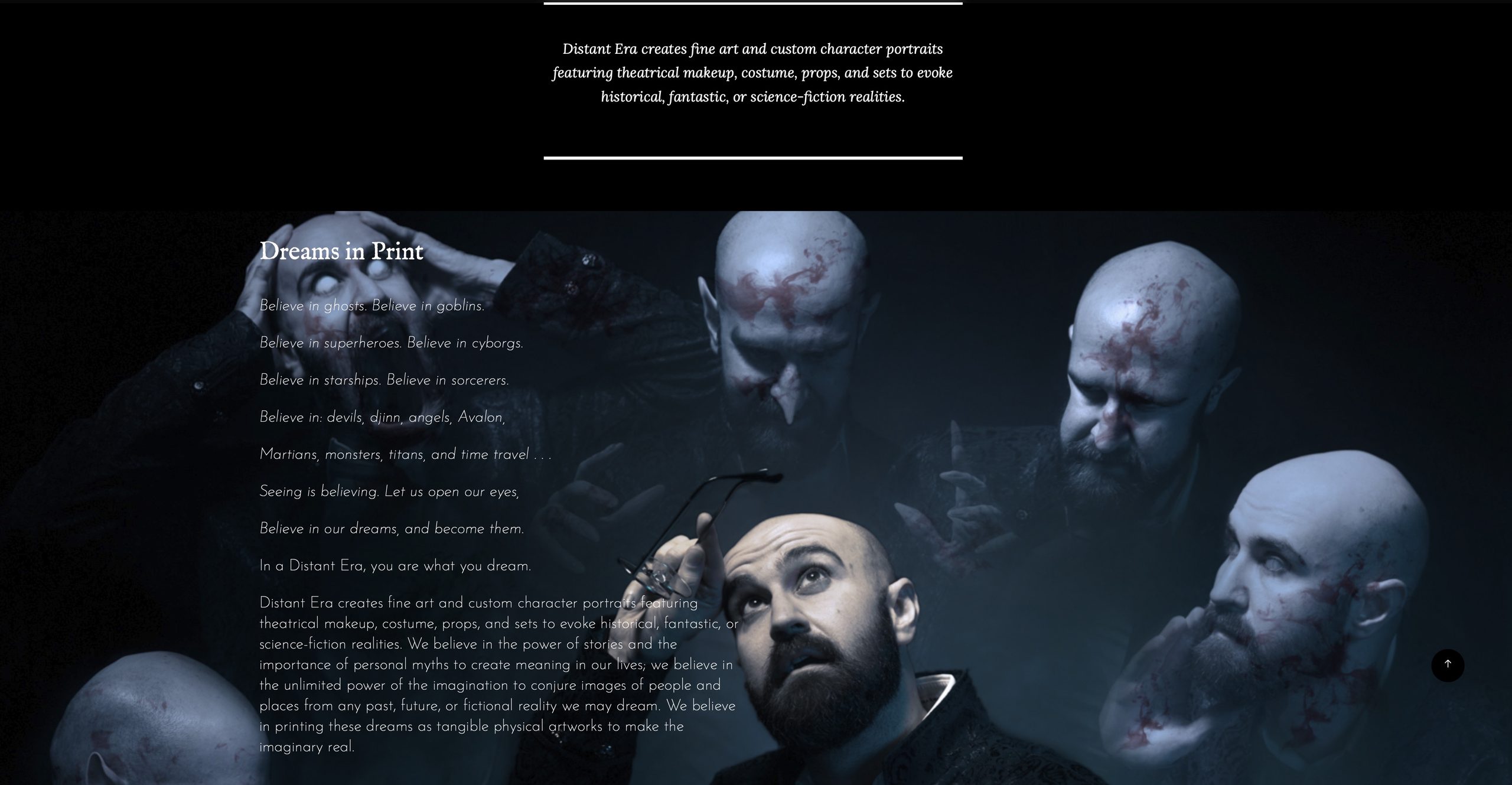
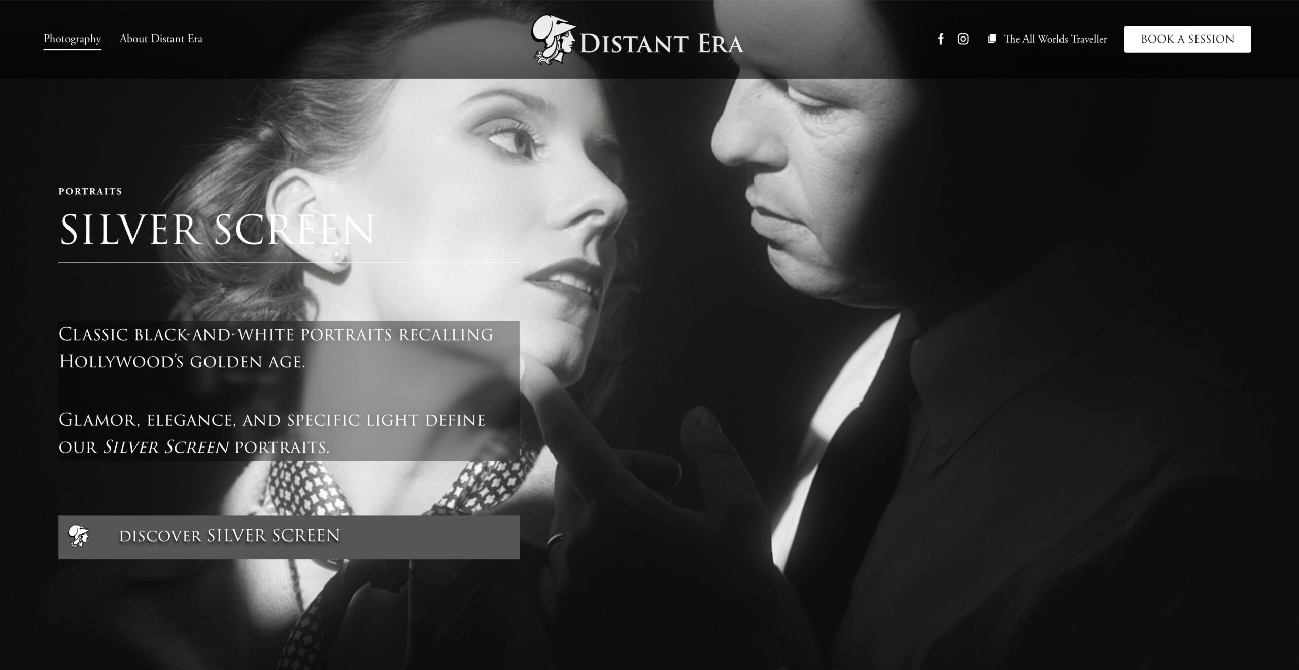
The example below compares a section from the original Distant Era site with a section from the new one. The former is all mood; the latter gets to the point and gets out of the way. And I might not even keep the section because it may be unnecessary.
A Less Important Mission
Here’s another example: For the longest time, I’ve kept the Distant Era mission statement at the top of the front page. You land at Distant Era, and these words tell you what Distant Era is all about.
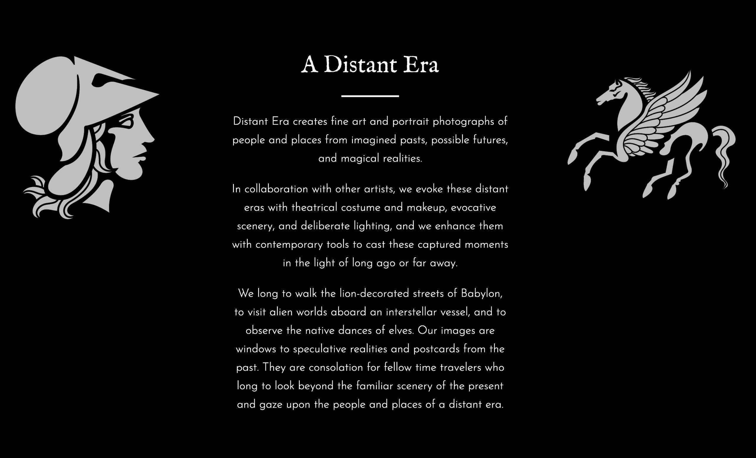
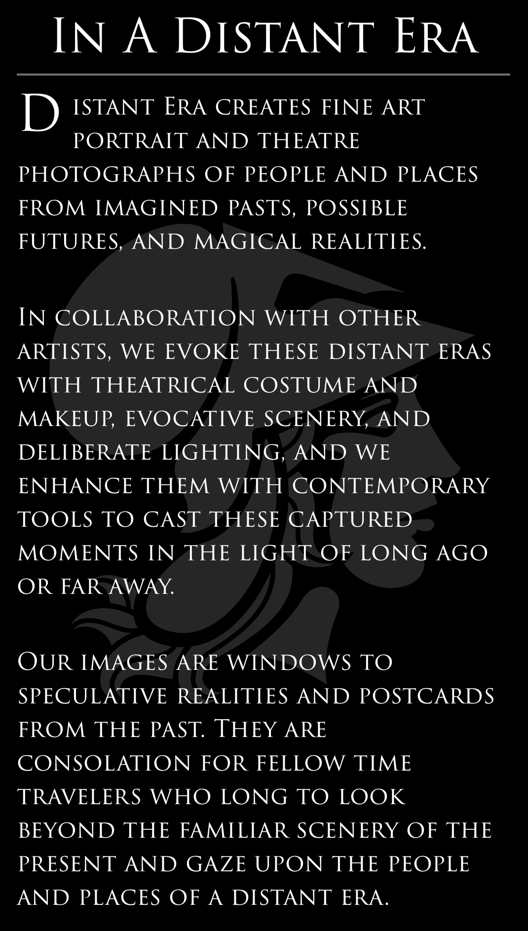
I relocated them this week and placed them on the About Distant Era page. I had resisted this change for years. As soon as I moved them, the homepage seemed so much more efficient.
I also removed a line: “We long to walk the lion-decorated streets of Babylon, to visit alien worlds aboard an interstellar vessel, and to observe the native dances of elves.“
When I wrote that line in 2019 or 2020, it was simply a way to make “I love history, science-fiction, and fantasy” more specific and interesting.
That’s still true, but it doesn’t need to be in the mission statement, and the work is going to communicate those feelings.
Style
I’ve maintained the same white-on-black look for the site. Compare the mission statements above, however, and you’ll notice that the new one is written in the same typeface as the Distant Era logo, as are all the other headings for the new website. I appreciate that consistency of design and of identity. Like every task building the new site, it took a while to figure out.
I also started scaling back flashy effects I had placed on all my new pages. As much as I love slideshows and scrolling pictures and Ken Burns style animations where the picture slowly pans and grows larger before fading into another, the longer these effects moved on my screen the more distracting I found them.
As of this week, I began revising the sections of my new site to make them look cool without being distracting. The revised (and revised and revised) homepage served as a model.
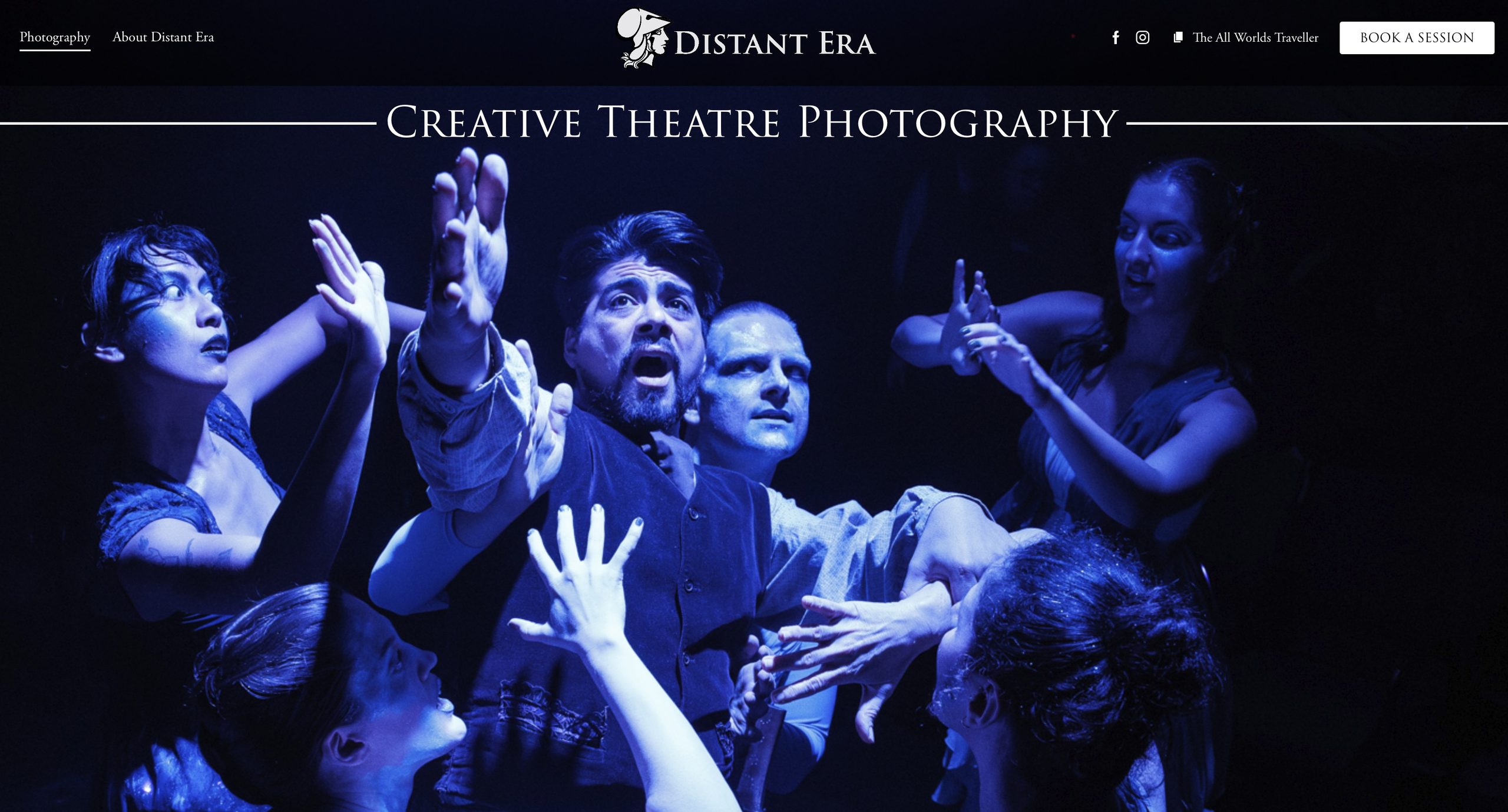
I didn’t want to totally forego my style, just pull it back and make it more manageable and less distracting. Each change is focused in that direction.
Portfolios
Over the years, I have contemplated giving up The All Worlds Traveller. It has never had many readers. It doesn’t offer advice or opinions. Its lack of ads and popups means it generates no revenue. And yet, whenever I want to show my work, there is a record of it. If a client wants to get an idea how I think or communicate, here are hundreds of examples. And now, as I build the new Distant Era site, I can link these posts to the works I post there. Here’s an example from the theatre section.
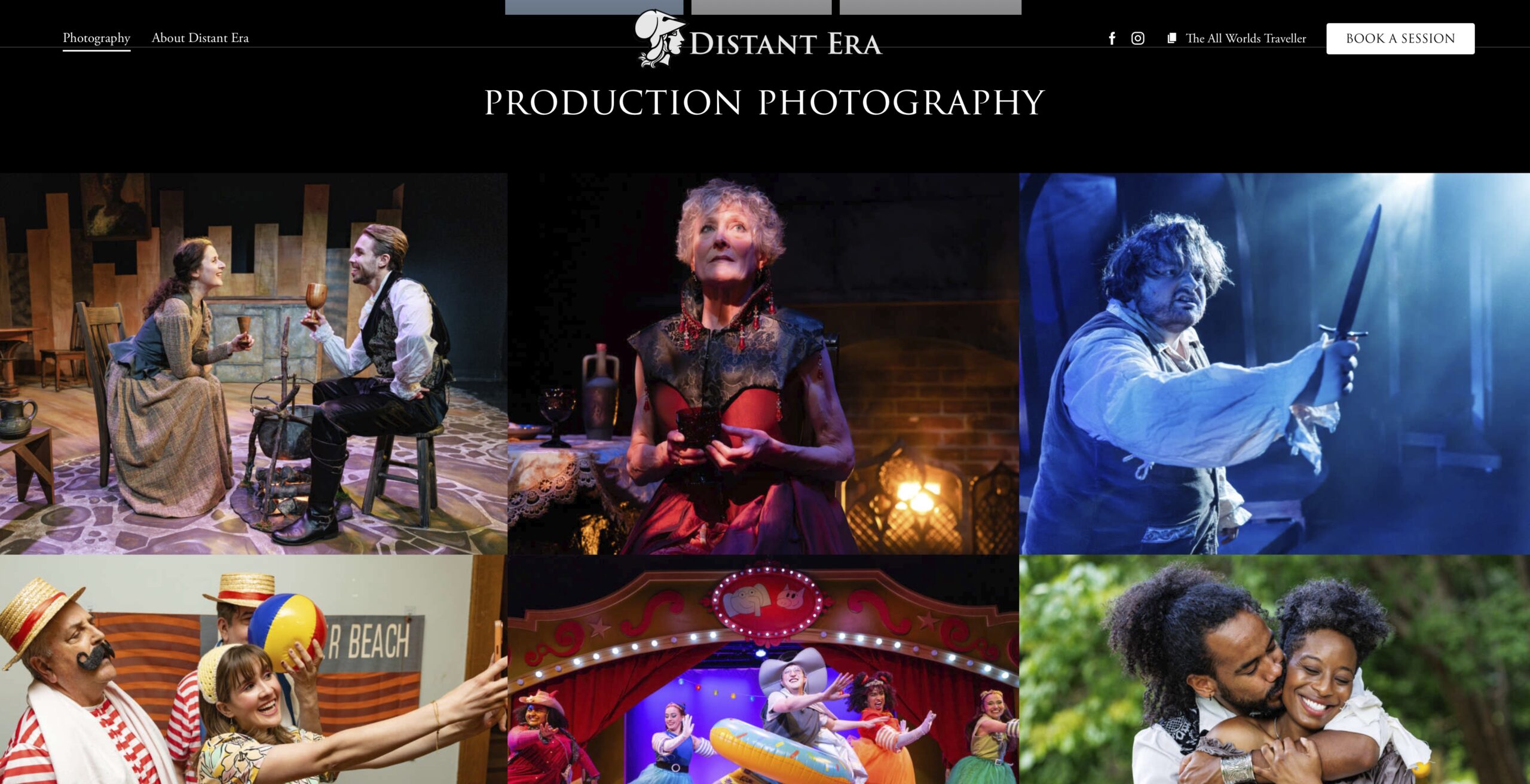
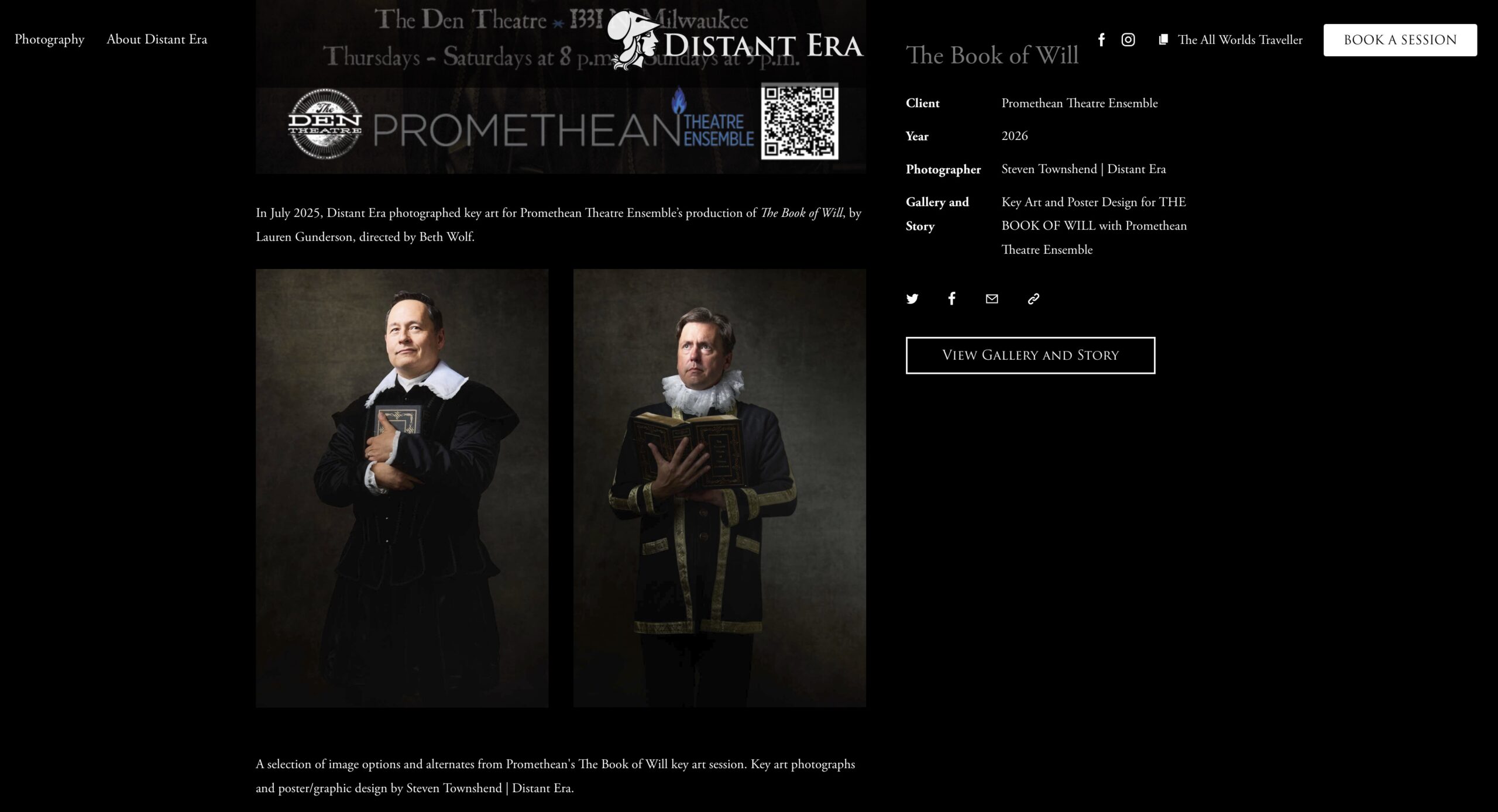
The first image shows the production photography gallery, where the show title appears wherever the mouse cursor goes.
The second image shows an individual entry—The Book of Will— in the Theatre Publicity category. This entry provides basic details about the company that produced the show, and it contains a button linked to a larger story and gallery on The All Worlds Traveller—this one, in fact.
Therefore, rather than post large collections of photos from each show on the website, I can link a single portfolio entry to a gallery that already exists on The All Worlds Traveller.
A New Homepage
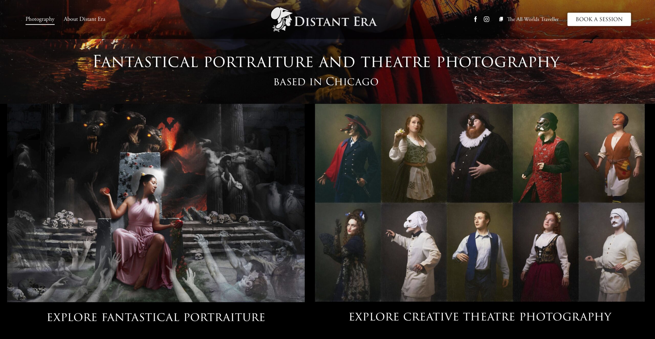
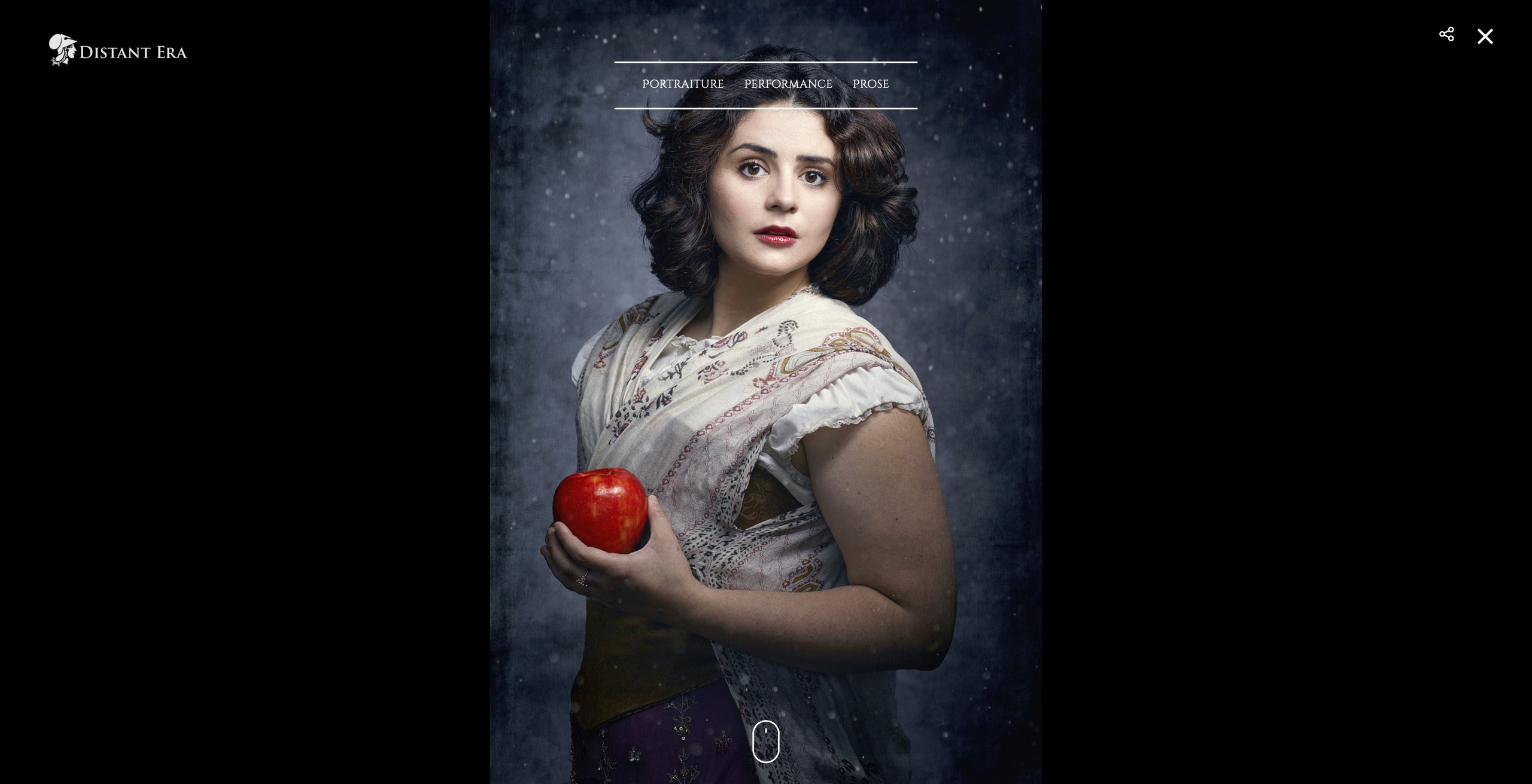
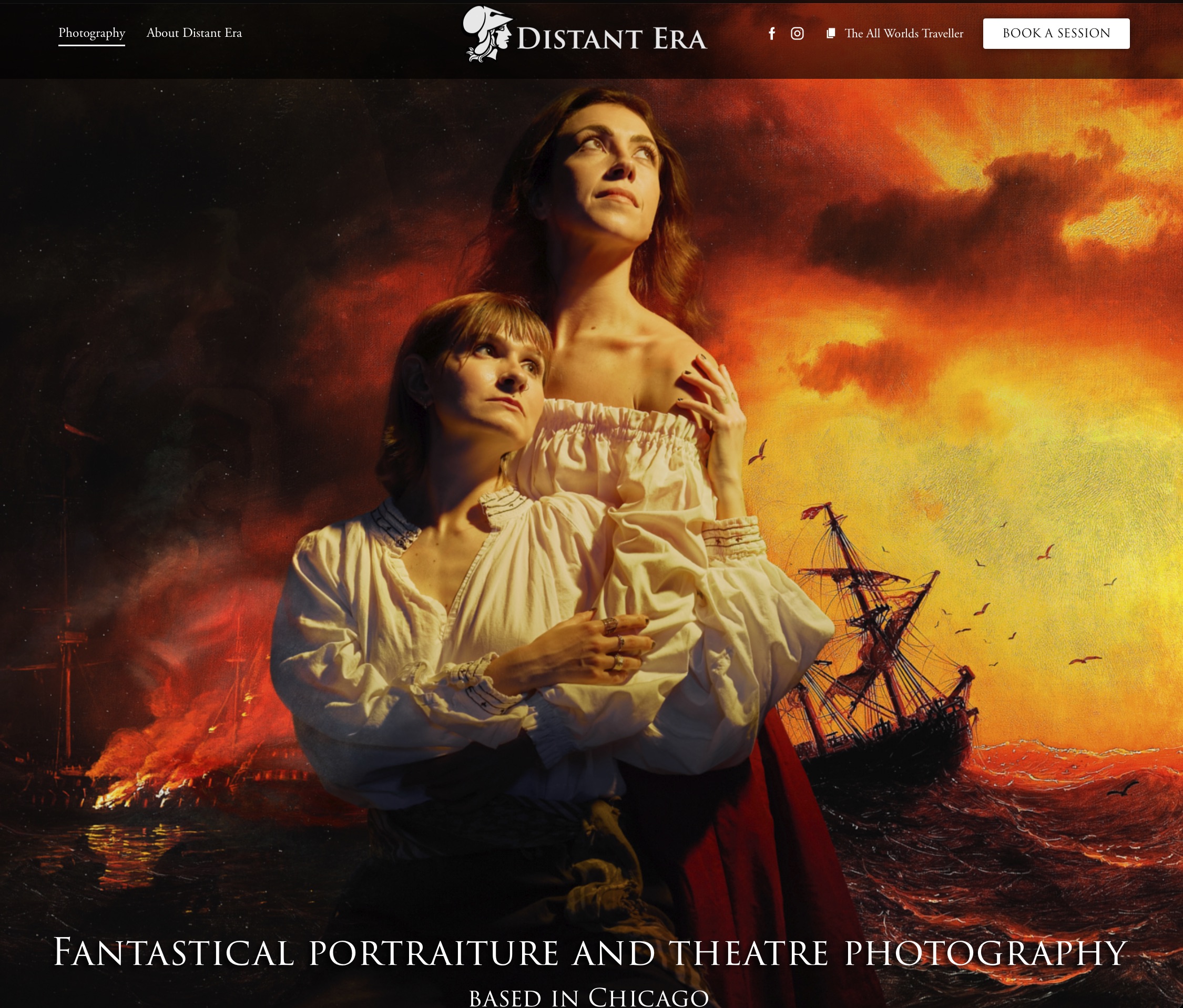
Speaking of the homepage, here’s a comparison between the original Distant Era website and the new one. On the original, you have to select a hamburger menu icon in order for the top center menus to appear. To contact Distant Era, you have to select “Prose,” then “Information,” and only then will you find the contact button. I chose to bury the option during the pandemic and never fixed it. On the new website, there’s a contact option on every screen. Since The All Worlds Traveller contains a vast amount of information about Distant Era’s work, it’s linked everywhere. There’s also lots of negative space on the original site. I never minded that much, but I do prefer the big, splashy image that greets visitors on the new site.
Trial and Error, Error, Error
I am not a web developer. Designing a new WordPress website has been a colossal effort. In my search for a new WordPress theme, I chose one that used a widely used page builder (Elementor) rather than a proprietary one that had no visual representation and that could disappear overnight.
I’ve made tons of mistakes and will make tons more.
Coming Soon
Some of the things I previewed here may not appear on the final version of the site, which I hope to launch around the New Year. I will likely need to make considerable changes for the mobile implementation, which will also take time. It all takes so much time.
For the past year, a redesigned website was a far-off dream. The goal is finally in sight. Once it has been launched, I’ll have a base upon which to build. I’ll update it more regularly and add new features as time allows. Maybe I’ll figure out that calendar or create an easy way to order prints. Most likely, I’ll take a deep breath and go back to creative projects for a while.






Follow Me